Monday 26 September 2011

A Great Impression

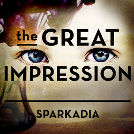
To follow up from the success of Sparkadia’s 2008 album Postcards, main man Alex Burnett presents the Mary Tour to showcase new album The Great Impression released earlier this year. As an indication of the group’s trajectory, the last time they played in Brisbane was at Ricks some time after midnight, however on their return they’ve headed the bill at the Tivoli Theatre with a score of popular singles on the board.  
Peppy Canadian indie pop group Imaginary Cities warmed up the venue with their clean wholesome tunes and post-adolescent positivity, proving why they have had recent success on Canadian campus charts. Playing new material to an uninitiated audience, Imaginary Cities were quick to draw the crowd in close as lead singer Marti Sarbit’s spotless vocals sat cleanly atop chiming keys and cruzy guitar riffs. They were a fun, tidy outfit and were received well on their first visit to Brisbane.
The only original member of Sparkadia’s 2008 line-up, Burnett has returned from London with a newly formed line-up and a revitalised sound. The group has arrived at a punchy, pop heavy sensibility that reflects Burnett’s polished new album full of radio favourites and catchy choruses. The first song in Sparkadia’s set (and title track of the album) The Great Impression kicked off what was to be a strong performance by Burnett in which the clarity and force of his voice was impressive throughout.
Anthems like China, Love Less Love and Talking Like I’m Falling Down Stairs were sure crowd pleasers, but the best was reserved for current single Mary. The song has a huge sound when heard live. The thump of the beat was commanding when combined with a forceful lyric delivered with the help of female gospel singers. It is easy to become excited about the future of a band when these moments of electricity are experienced live.
Knowing only Sparkadia’s radio singles over the last few years meant that seeing them in concert was something of a new discovery. Their current outfit serves the strengths of their material with an engaging stage presence and convincing cohesion. With the Mary Tour wrapping up and Summer festival appearances still to come, Sparkadia are on the list of Aussie bands to keep an eye and an ear out for.
Dale Harding

Saturday 24 September 2011

Broken Screen: Expanding the Image, Breaking the Narrative: 26 Conversations with Doug Aitken

Edited by Noel Daniel
Distributed Art Publishers, 2006

 What I will cherish most from art college are the casual and often stimulating conversations over a pint with my peers and mentors - a sharing of ideas and opinions on art, philosophy, politics and life. California based artist, Doug Aitken, appears to have a similar passion for dialogue. In 2006, Aitken produced the book Broken Screen: Expanding the Image, Breaking the Narrative, an archive of candid conversations between Aitken and 26 of his own peers and mentors.  Luckily for Aitken, his friends include leading artists, filmmakers and architects such as John Baldessari, Matthew Barney, Pippoloti Rist, Chris Burden and Rem Koolhaas. The overarching topic explored throughout these conversations is nonlinearity and fragmentation as an expanding tool for communicating and making art.  It’s about perception, the unexpected and making sense of the world. As Bruce Conner states, ‘it’s about consciousness itself’.

Doug Aitken is an artist, film maker and somewhat of a ‘darling’ within the LA art scene, known for his large scale and complex video installations and architectural interventions.  Aitken is no stranger to the international art world, having travelled extensively and participated in over 150 exhibitions worldwide.  The idea of temporal landscapes and a transient lifestyle is often expressed in his work, constantly moving away from linear narratives and instead favoring fragmentation to honor the mystique of a life in constant flux. 

The list of names presented on the cover of the book is impressive, however the book presents a rather transatlantic and male centric view point, with only three females and not one Asian artist included. The conversations also feel like they are born from a mutual appreciation society with the constant praise for each others work and creative processes littered throughout. This aside, the relaxed format of the text and the interesting ideas discussed in this book, results in a stimulating read for anyone questioning their existence in this modern and chaotic world.  It is also an encouraging read for artists that are wanting to explore different means of reaching the inner consciousness of their audience and allowing the viewer to reach their own conclusion...beginning...or defining moment in between.

Caitlin Franzmann

Thursday 22 September 2011

PINA - The Essence of Pina Bausch


A sea of bodies urgently sweep across the soft dirt that is seemingly floating in a black void.  Dirt gradually clings to the sweat of the powerful figures stamping, churning and collectively moving to the pounding energy of the Stavinsky’s score - The Rite of Spring.  This visceral performance is only the beginning of the film PINA and yet I already notice myself being drawn into the sensual landscape and touched by the raw emotion of the performers.

PINA is a 3D film created by Wim Wenders for Pina Bausch, the influential and inspiring German choreographer and dancer, who passed away in 2009.  The film takes the viewer on a journey through some of Pina’s most significant works of choreography, performed by the Tanztheatre Wuppertal ensemble to which she dedicated the last 35 years of her life.  The film follows the dancers from the stage out into urban and industrial settings of Wuppertal city and surrounding areas. Wenders couples his ability to visually capture the essence of a place with Pina’s incredible skill of sculpturally placing the body in and through space.

Pina’s expressive works ultimately address reality and key questions of human existence -  of love, hope, desire, intimacy and fear.  Many of those fortunate to have seen Pina’s performances have spoken of an exhilarating experience and being moved deeply.  Wenders admits to his initial reluctance in filming Pina’s work, for fear that he would never be able to capture the intoxicating power of these performances on camera.  Many would claim that it is impossible to translate the embodied experience onto a cinematic screen, however, I would argue that Wenders, through his sensitive use of 3D technology and camera skills, has come very close to providing the audience with a real sense of how it might feel to be sitting amongst the audience in the Tanztheatre Wuppertal.

The film is not a biography of Pina, but rather a archive and alternative language for such an ephemeral art form that is dance. The film also delves into the human essence of Pina through the performers poetic reflections on how she has touched, influenced and encouraged those around her.  I have not seen a Bausch performance in the flesh so I personally am grateful for Wenders in creating this opportunity for myself and so many viewers around the world to experience the ‘encounter’ that she sought to achieve through her work.  Through his film, Wenders has sensitively and poetically extended Pina’s philosophy of giving dance back to the common humanity.

Caitlin Franzmann

Wednesday 21 September 2011

Lynne Allen has Brisbane by Hook, Line and Sinker


Tamarind trained Master Printmaker and Head of the School of Visual Arts at Boston University, Lynne Allen’s exhibition Hook, Line and Sinker at POP Gallery, forms part of her residency at Griffith University’s Queensland College of Art in Brisbane, Australia.

Much of the artwork included in the exhibition draws on Allen’s Native American Indian past, which can be traced back through the women of her family (1). It is her great grandmother Josephine Waggoner (who appears in many works in the exhibition) with whom Allen feels a particular connection to after inheriting many artifacts and writings in 2002 which belonged to Josephine. Allen’s discovery of her rich history and sense of injustice that as a white woman, she was proof of the success of the assimilation of the Native American into European society, steered her art practice to the task of reclaiming her heritage and bringing to light the atrocities in the history of American colonization (2).

Installation shot of Spurs, Moccasins, Size 9D and Rider Photogravure
Pop Gallery, 2011

Both of these endeavors are particularly evident in Allen’s 4 photogravures on the back wall of the gallery, depicting riding spurs, beaded moccasins, antique wooden shoe forms and a children’s Indian figurine. Each is printed individually in large scale monochromatic colours using the photogravure technique, chosen for the fact that it was invented during the period of American colonization (1). Rider in particular, is a visual testimony to the power imbalance between European settlers and Native Americans with a small children's Indian figurine perched atop a large 'western' shoe form. Thus demonstrating the ease with which the native population was overpowered. Next to this print, Moccasins and Size 9D can be seen to represent Allen’s own duel heritage as one can imagine questions of her identity caught in the empty space between her mothers Native Indian moccasins and her fathers European shoe forms. Further evidence of Allen attempting to connect with her culture can be found in My Winter Count depicting a timeline of shoes connecting Allen to her great grandmother and to her heritage as both women and their stories are depicted above the shoes.

My Winter Count, Screenprint, lithograph & chine Colle. 2001.
from http://lynneallen.com/prints.html

Shoes are a prominent feature in Hook, Line and Sinker which brings to mind the old proverb ‘do not judge a man until you have walked a mile in his shoes’. This appears to be what Allen is attempting to experience for herself as well as display to viewers in works such as Sitting Bull Moccasins. By recreating an old tradition with paper etched with imagery of native culture instead of with leather and beads, Allen appears to be attempting to find new ways to teach viewers about a forgotten (and sometimes denied) past.


Sitting Bull Moccasins
Etching on handmade paper, handwork, linen thread, tea bags
2003  from
http://lynneallen.com/gallery.html
This endeavour is not only relevant to Native American history but to the history of any inhuman mistreatment. Allen's work is evidence of art's ability to stand against injustice and bring greater understanding. Such an exhibition is ironically suited for display in Australia considering our similar past of European settlement and Indigenous treatment.   


Hook Line and Sinker
is not only a comprehensive display of Allen’s mastery of printmaking but an evolving story to claim her heritage, correct falsehoods and declare truths (2).


By Jessica Row
----------------------------------------------------------------------------------------------
(1)  From Nature Morte exhibition catalogue by Lynne Allen, published 2009
(2) From conversations with the artist.
----------------------------------------------------------------------------------------------
Lynne Allen’s Exhibition Hook, Line and Sinker is on display at POP Gallery, 12 Ipswich Rd, Woolloongabba, QLD, Australia from 14th September to 1st October 2011.
www.lynneallen.com
www.popgallery.com.au

Tuesday 20 September 2011

The Isenheim Altarpiece and the Abbot's Herbarium

. 
The Visit of St. Anthony to St. Paul the Hermit (detail) & the Isenheim Atlarpiece (open position)


The Apples of Apollo1
Carl A. P. Ruck; Blaise Daniel Staples; Clark Heinrich
Pages: 216 - 232

The Isenheim Altarpiece is the high altar of the Anthonite abbey church in the Alsatian village of Isenheim. Through its several configurations, it displays various scenes from the life of Christ and the somewhat eccentric career of St. Anthony the Hermit. Although originally commissioned in 1460, it is the painted panels executed between 1512-1516 by the German artist Matthias Grünewald that the discussion is chiefly concerned with.

The Anthonites were a hospital order originating in south-central France. The brotherhood however, traced its spiritual lineage from the fourth century Egyptian ascetic St. Anthony the Hermit, who founded the Thebaids, an anchorite community living in the desert. Due to the recognition of St. Anthony’s shamanistic trials in the wilderness, Roman Catholicism came to place him in the company of those such as John the Baptist and Jesus himself. He consequently assumed the role of protector against temptation and illness; a healer saint, who inevitably embodied the ancient dichotomy of healer/inflicter, where the healer of the toxin was also the holder. He was the patron saint of ergotism (the primary infliction of seekers of the Anthonite order), his emblem was the pig, and accordingly was considered the patron of swineherds, merchants, mushroom gatherers and purveyors. Believed to wander the forests with his belled staff, he dispersed the evil spirits which kept the good mushrooms out of sight. 

And so, the Isenheim Altarpiece: the emblematic focus of the pilgrim. A vehicle for the inflicted to embody the divine suffering and resultant jubilation of the successful saint and Christ. Three arrangements of nine paintings, excluding the predella. In the closed position, the Crucifixion dominates in the centre, flanked by a serene post-martyred St. Sebastian at left, and a contemplative St. Anthony to the right. The semi-open or middle position features (from left to right) the Annunciation, an Angelic Court, the Nativity and the Resurrection. Finally, in the open position we find the 'shrine', gilded carvings of an earlier altarpiece (featuring an enthroned St. Anthony flanked by Sts. Augustine and Jerome above Christ and the twelve apostles). This, framed by The Visit of St. Anthony to St. Paul the Hermit (left), and The Temptation of St. Anthony (right). 

 The literal description seems simple enough, albeit inconsistent: a menagerie of disparate events in St. Anthony's career and the life of Christ, compiled in poor chronology. And of course, this has confounded, to varying degrees, the minds of critics and historians for centuries. It is here that the authors attempt to harmonise an apparent discord.  

Allowing the seemingly incoherent semantics to be appreciated as a deliberate and informed arrangement, the authors have endeavoured to illuminate the mystery and motives behind an obscure and antiquated symbology. Spacial relationships in conjunction with subtle visual accentuations and iconographic tweeks are convincingly utilised to tend the reader towards more involved and abstact signals and symbols. An increasingly informed observer results, in anticipation for a pronounced but humble representation of the order's gnosis. The Anthonite's pharmacopea.

Rigorously researched, linguistically precise and written with the kind of acute awareness essential to the study of culturally sensitive or taboo subject matter; this text and its parent work offer a high water mark in the academic inquiry of this genre. Although at times tending towards the verbose, it is the care and absolute pride in the work itself which will stand sentinel over time.

Iason Yannakos


1. Ruck, C, Staples, B & Heinrich C, 2000, The Apples of Apollo: Pagan and Christian Mysteries of the Eucharist, Carolina Academic Press, North Carolina

Three Winter Coats and a Dirty Knife

Nine Lives 25/08 - 18/09/2011

Brisbane’s favourite cupboard-sized ARI Nine Lives is host to Three Winter Coats and a Dirty Knife, an exhibition featuring five local emerging artists. Drawing inspiration from a Neko Case song, this group show is built around a narrative of isolation in the wilderness. Both the artworks and the installation are raw and uncompromising, lacking institutional polish but with heads held high and justifiably so, as there is some serious skill present in this exhibition despite some rookie errors.

This show’s greatest strength is the quality of the individual artists’ work. Dan Ford’s whimsical drawings depict endearing characters enacting bizarre scenes, neatly packaged in odd frames, stylistically a mix of Korean cartoons and East coast pop-surrealism meeting a French salon. Contrast these with Kylie Spear’s intricate and controlled line drawings, which speak simultaneously of the free-flowing unconscious and obsessive repetition. Despite drastically different modes of representation each of these artists depicts the theme of insanity through isolation with style. But style can never be enough on its own, and though Jesse Olsen has the former in spades and the technical skill to match, his work lacks the substantive content necessary to move from the realm of illustration to that of contemporary art.

Installation shot 
Ultimately the mix of artists works well together, and restricting the exhibited works to ink on paper was a clever move offering welcome continuity to what otherwise could have been an extremely eclectic show. Curator (as well as exhibitor) Ellie Andersen should be congratulated on successfully uniting five artists who cohesively explored her experimental theme, however the overall installation leaves something to be desired. Presumably looking to create an atmosphere Andersen has lit the show with antique lamps and positioned theatrical bric-a-brac (suitcases, leather bound books, horns) around the gallery space. Unfortunately, this attempt to place the artworks within an environment evocative of the overarching narrative fails, leaving an impression of an antique shop that just happens to have some art on the walls.

Although the show is not entirely successful in its execution, it is testament to the importance of ARIs like Nine Lives. Few other venues would encourage such experimental installations as attempted in Three Winter Coats, or offer so much support to what is at the end of the day a drawing exhibition. Galleries like this provide space for emerging practitioners to test the waters for their ideas. And if shoddy, distracting lighting is the price one has to pay to see some of the most intricate and passionate drawings I have seen on show recently, then so be it.

Lisa Bryan-Brown

Face in a Crowd: New Portraiture


Face in a Crowd: New Portraiture
@ Ipswich Art Gallery, Ipswich

A face, a portrait, an image, a photographic representation of a person; what can this say? Can a mere portrait tell you more than words? Ipswich Art Gallery’s Face in a Crowd: New Portraiture aims to question the idea of portraiture itself, using it as a device to critique social norms and an images’ ability to express individuality and identity.

Using portraiture, four artists create photographs, videos and sculptures using methods of morphing and layering, to question the impact of today’s fast paced, consumer and technology driven society. Though unconventional, the works remain on a photographic plane, as they retain the inherent stillness, which allows the viewer to read the images similarly to a photograph; but transcend the more literal definitions of what constitutes a standard print. Each of the artists in the exhibit use photography somehow, whether is be a video still printed and re-sequenced in David Rosetzky’s videoWithout you, 2004, or more conventional still methods such as Simon Obarzanek’s Untitled (80 faces). The exhibition also features artists such as Denis Beaubois and Justine Khamara, offering up both video and photographic sculpture to the viewer.

Justine Kamara’s sculpture, Erysicthon’s Ball, 2010 uses the Greek myth to question modern societies vanity. The large spherical sculpture is made from ten thousand photographs of a single person, shot from different angles to create a three dimensional and obscured image, once it is collaged onto sphere. The subject holds varied facial expressions, referencing the self-absorbed activity of taking and posting a multitude of images of oneself. In which social media sites such as Facebook, have resulted in an individualised attempt to control personal representation and perpetuated the phenomena of self vanity.

Kamara’s photographic sculpture is the clearest example of the hybrid use of photography and portraiture within the exhibition. It leads one to revisit notions of post-medium (as discussed by Rosalind Krauss, Geoffrey Batchen, Anne Marsh and other critics), in which photography re-defines itself. The medium is hybridized with another such as photography and sculpture or painting and the authenticity of the medium itself is questioned, due to its erratic nature. Comparatively Rosetzky’s photo collages also create a sense of depth, not as dramatically three-dimensional, through the use of multiple images which are layered via sliced cut outs. Similarly, the use of video and digital media, manipulated the language and foundations of photography by altering the method by which the viewer digests content. The temporal stillness of a photograph is retained so that only subtle movements are noticeable and make us question the reality of photographic representation. Overall, Face in a Crowd provides an interesting window to critique contemporary society through the use of everyday portraiture, which is intuitively readable and tied to notions of reality and modern existence.

Sancintya Simpson

Gonkar Gyatso @ IMA

Gonkar Gyatso’s Three Realms
@ Institute of Modern Art, Brisbane

Gonkar Gyatso's pastiche of colourful collages are currently exhibiting at the Institute of Modern Art. His latest exhibit, Three Realms, questions the morals and motives of today's globalised society, drawing from his own Tibetan heritage to reflect and question. In this latest exhibit Gyatso comments directly on globalisation and the subaltern (those without a voice) all in an effort to break down Eurocentric misconceptions and ways of thinking.

Situated in the first gallery are six large paper collages, each work a word from the title (Excuse Me While I Kiss the Sky).  Inside the large capitalised block letters sit layers of stickers, news clippings and other found imagery combined with charcoal and dots, forming a pastiche of references. In the next room sits a large Buddha in the lotus position, covered similarly with symbols of modern day society. The Chakra points of the body are represented by circular black and white stickers, uniform in size, standing out in stark contrast to the bright pop symbols. The monochromatic circles range from anti-Buddhist imagery (such as an image of Buddha with a thick line defacing it), bonafide Buddhist cultural symbols, to the BBC logo and the Amnesty International logo surrounded by the words 'Made in China'. These works are in a similar style and commentary to Gyatso's previous work God Series 12008 in which an OM symbol is constructed out of assorted stickers, commenting on culture as a commodity. This makes Excuse Me While I Kiss the Sky, 2011 seem as though it is a simple rehash of Gyatso's previous work and that perhaps he is commenting on himself as an artist becoming a commodity, with the push to create more of what is desired and popular. One of his works in 108 Burning Questions2011, features the question “APT6, Validity” also leads one to think so.

Similar themes are prevalent in the rest of the small-framed collages surrounding the adorned Buddha. 108 Burning Questions2011 are positioned around the room in a regimental arrangement. The number 108 is sacred in Buddhism, Hinduism and many other Eastern religions and cultures. In Buddhism it is believed (in some groups of thought) that there are 108 defilements/wrong doings. The 108 images could be seen as questioning wrong doings but they are quite varied. Images of Middle Eastern men are combined with the question “Are you with us or against us?”, a collage of Eastern deities are paired with “Stolen Goods?”. Politicised and controversial statements are placed with more universal and reflective questions such as “Can tea promote world peace?” and “Why do some have so little and others so much?”. The combination of collage and text placed within the border of the white frame eases the viewer into reflecting upon the question posed by each work.

108 Burning Questions, 2011 was the real work (in contrast to the large text based collages), re-examining issues rather than just reproducing old content in a different form. In this series he raises questions of who has power in today’s globalised society and how non-Western culture has become an economic being, a commodity, exoticised and removed, with new homogenised meaning. Through the use of found images juxtaposed against text, Gyatso invites dialogue to be opened on ideas of morals and power, questioning the cultural norms of today's world.

Sancintya Simpson

Gonkar Gyatso | Three Realms

Institute of Modern Art, 20/8 – 15/10/11

 “EDUCATION REVOLUTION?” “WHO’S IN CHARGE?” Gonkar Gyatso asks, and coupled with his witty collaged drawings you can’t tell if it’s funnier than it is serious. Repetitiously hung, the collages which make up 108 Burning Questions fill the room. The tight hanging of the small, engaging works mean viewers file around the gallery’s perimeter in a procession not unlike the check-out line at the supermarket. A fitting outcome considering Gyatso’s work deals with themes of consumerism, globalisation and identity. In each small frame a ‘burning question’ encircles a montage of images lifted from pop-culture and advertising, enhanced with drawn elements. At the centre of each is a BRAND NAME beer bottle label, a recurring idol offering a rhythmic continuity to the series.   

Spotlight and central, a sculptural Buddha complete with chakras glitters with multicoloured snippets from magazines, newspapers, novelty stickers and shopping catalogues. Again the overwhelming use of colourful headlines and images achieves a fine balance of controlled chaos, a metaphor for the modern condition which extends throughout most of Gyatso’s work. The contemporary overlapping that is occurring between traditional eastern and western centres is another of Gyatso’s consistent themes, which is certainly most successfully addressed in Bhudda.  

In the adjacent room a large text based work reads “EXCUSE ME WHILE I KISS THE SKY.” The phrase surrounds the viewer immediately evoking an audible memory of Hendrix rasping the line, his psychedelic guitars embodied by the brightly coloured stickers and dripping charcoal. The powerful over-all impact of the work is heightened by closer inspection of each letter, revealing the interplay between the disparate stickers. A unicorn jumps off a convertible and into a hamburger there, while not far off Snoopy smiles dopily at a telephone booth. The impossible world Gyatso has created within the letters of this iconic statement, where recognisable images interact seemingly randomly, speaks concisely of the cultural collision that is globalisation.
 
Three Realms is a series of three survey exhibitions of Gyatso’s work to be hosted by a handful of Brisbane’s public galleries, the first being held at the IMA. If this initial taste is anything to go by the next two instalments, to be held at Griffith University Art Gallery and UQ Art Museum in February of 2012, will be events not to be missed.

Lisa Bryan-Brown

Dreaming of Chanel: A Patronising Nightmare

QUT Art Museum: Dreaming of Chanel
Sponsored by QueensPlaza
26 August- 16 October

Grant Cowen Untitled 2010
 Described as an exhibition about the dreams attached to clothing1 Dreaming of Chanel is a frothy, insubstantial exhibition which panders to a romanticised view of the feminine. Curated by QUT fashion PhD candidate Nadia Buick one would expect more. In its limited regurgitation of content it is like walking through a pop-up version of the book of the same name by Charlotte Smith. Both the book and the exhibition are based around the Darnell collection of vintage dresses which Smith inherited in 2004 from her godmother Doris Darnell. The collection, which is considered to be the largest private collection in Australia2 with pieces dating from 1790 to 1995, is certainly an impressive resource of textile craftsmanship. 

As a precursor to the exhibition QUT Art Museum senior curator Vanessa Van Ooyen organised a public lecture, on the 4th of August, by Valerie Steele on the topic ‘Is Fashion Art?’3 This insightful discussion raised highly relevant issues in relation to the binary relationship of fashion and art; body and spirit; and feminine vanity and masculine genius within visual culture.

All the raw ingredients for a truly exceptional exhibition were at Buicks' fingertips. Unfortunately this potential was completely undermined by a copy-paste style of curating which leaves much to be desired in an academic context. The modest selection of garments chosen for the exhibition are displayed on manikins on raised platforms and are divided into four sections; A History of Women, F is for Fashion, Things I Treasure and Love Stories. The clusters of original images by textile illustrator Grant Cowan and the nostalgic, conversational anecdotes in the exhibition guide4 which correspond to the numbered manikins are the only additional information used to contextualise the works and are sourced directly from Smiths book. The emphasis on brand names, fashionistas, elite socialites and gossip titbits stands out as being incredibly inappropriate for a gallery context.  The suggestion that the privileged white women who owned the nine dresses in the first section in any way represent a “History of Women” is insulting. As for the inspired category of “Love Stories” to complete an exhibition of feminine fashion, it is a fitting summation of a clichéd, poorly thought out display of narrow minded notions about what it is to be a woman. Perhaps they took their sponsorship by QueensPlaza a little too seriously. 

Eileen Abood

1. Queensland University of Technology, 2011, ‘Dreaming of Chanel’, viewed 17 September 2011, <www.artmuseum.qut.edu.au>.
2. Feeney, K 2011, ‘Million-dollar wardrobe to stun Brisbane fashionistas’, Brisbane Times, viewed 19 September 2011, <www.brisbanetimes.com.au>.

On the Grid draws favourable parallels

Pickle Gallery September 15 - 20 2011
Nicola Scott
On the Grid is an example of how a student/emerging art exhibition (while it can be discussed in myriad ways beyond this reductive description) can give commercial galleries and museums a run for their money. This is not always the aim of such shows, and obviously there are other ways of presenting art, however in the case of On the Grid and many other ‘amateur’ shows, the exhibition was presented according to the overarching format – grid – of the art gallery/museum institution and its associated conventions.
In many  emerging artist exhibitions the attempt to replicate a more professional gallery setting focuses attention on just how far they fall from the mark (somewhat understandably due to space, time and money constraints): the space is cramped; works are carelessly and haphazardly installed; there is no indication how the works speak to a central theme or concept, or to each other; catalogues are black and white stapled affairs or missing altogether, rarely if ever with substantial supporting text or an ISBN number. While this may sound like an overly harsh assessment of the efforts that routinely come out of QCA and other tertiary institutions, it is not an attempt to insult or discourage. I have taken part in such shows and they are, for all their shortcomings, necessary, inspiring and affordable ways to get your work shown, discuss ideas, receive feedback and to network. However, in the attempt to replicate the gallery setting, in which those involved generally aspire to one day show their work, some key roles and rules are usually left out. On The Grid shows what can be achieved when the structures and job descriptions of the gallery are adopted from start to finish –beginning with a passionate curator with a coherent idea of what the exhibition is about, when artists are carefully selected according to this criteria, when works are innovatively arranged in the chosen space, precisely installed and shown to their best advantage, when the space is well-lit, the catalogue is professionally produced, when a talented writer enlisted to research and write an accompanying essay, and when every space is utilised to maximum effect.
On this last point, such banal things as a fresh double-coat of white wall paint, an unobtrusive refreshment table, spotlights on works and thought-out floor plan can have a surprisingly powerful effect on the overall experience of the show.  Curator Lisa Bryan Brown’s savvy placement of works in a diagonal zigzagging formation, managed to use a limited and difficult area of space (two long narrow corridors and a small square room) to maximum affect, giving visitors room to step back from work. Similarly, the importance of including a well-researched essay, accompanied by colour photographs of each artist’s work, should not be overlooked in the chaos of planning a show. As the primary documentation of the exhibition, Kylie Spear’s discussion of the ideas underlying the exhibition title and the selection of art works demonstrates the merit and contemporary significance of the show and those involved. By placing these ideas into the larger framework of art historical and theoretical discourse, and suggesting the grid’s ongoing significance in contemporary life and artistic practice, the published catalogue essay opens a discussion around the works that then exists to be engaged with by others after the show has ended.
By putting into play the key conventions and designation of roles central to the fsuccess of the gallery institutions they choose to replicate - more closely than many other shows featuring emerging Brisbane artists -  it is less of an imaginative feat to envisage those involved in On the Grid appearing on the wider grid encompassing commercial galleries and art institutions in the near future.

Arryn Snowball at Heiser


Undone 13 September – 8 October
Arryn Snowball
Heiser Gallery

Undone is the latest commercial presentation of the doctoral work of Queensland College of Art tutor Arryn Snowball. Showing through Heiser Gallery in the art precinct of Fortitude Valley, Snowball’s Undone brings together three of his more saleable series of work from this year, his synonym antonym series, a photographic series of sticks and shadows, and a collection of his steam paintings.
In his synonym antonym series, Snowball examines the fluidity of language, charting the progression of a word from its synonym, to the synonym of its synonym, and so on, until it reaches the antonym of the original word. This linear progression is printed on fine translucent paper, with the inverse progression faintly visible underneath printed on a corresponding sheet. The effect of this layering pairs the beginning and end points of the vertical linear progression with a juxtaposition of word and antonym, with the intensity of distance in meaning of subsequent words decreasing until the middle, where the two centre words are identical. In this wordplay, Snowball explores the relationship of meaning and contradiction, the viewer approaching the translucent and ephemeral sheets of paper and dictating the text of the work as if it was a romantic piece of spoken prose.
Steam 9, Arryn Snowball, 2011
Similarly, Snowball’s photographic series of stick objects and their shadows again challenge conceptions of truth, perceptions of objective sensory knowledge, and representations of reality. Here Snowball has constructed three-dimensional shapes out of small black rectangular-prism-sticks. Placing these shapes in a spaceless white vacuum, and using varying projections of directional light, Snowball documents the relationship between the object and the shadows it casts, the photographs bleeding together the pure black object and its counterpart pure black shadow to break down the solidity of the perception of the object.
It is within Snowball’s steam paintings however, where the romance and subtlety of this challenge to objective truth is most effectively articulated. Again working with photography, Snowball documents the visual appearance of steam captured on a digital camera against a vacuous black background. Using these photographs as loose stimulus, Snowball recreates the appearance of steam through large-scale oil paintings, detailing the soft unfolding contours of light and colour that can be drawn from perceiving the phenomenon of steam.
Considering these three series of work, the title Undone seems an appropriate summation of the intent behind these works, Snowball seemingly documenting the unravelling of that which is deemed concrete and infallible. Often this challenge to reason and perception as absolute truth is coupled with a championing of the chaotic and absurd. To his credit Snowball replaces these with a glorification of the romance of subtlety and transience, leaving a sense of delicate beauty as opposed to illustrated nihilism.

Llewellyn

Monday 19 September 2011

On the Grid - (Eryn Begley)


On the Grid 
15-20 September 2011
@ Pickle - Contemporary Artisans Collective
Windsor, Brisbane

Lisa Bryan-Brown’s latest exhibition, On the Grid, brings together an eclectic mix of sculptural works, some designed for the body, some drawn, others crafted from metal, all created within the conceptual framework of ‘the grid’. Bryan-Brown proposed a show which dealt with the thematic concerns of the grid, something which is reoccurring in her own artistic practice, and set about inviting others in her field to join her in this endeavour. Rather than sending out a generic email vaguely outlining her intentions, Bryan-Brown chose to contact each artist individually, explaining just how their work suitably fit the proposed show. Notably, Bryan-Brown elected to not only curate On the Grid, but to showcase her own work in the exhibition.
Although Bryan-Brown expressed some disappointment at two ‘big names’ that declined her invitation, encouraging the artists who did participate wouldn’t have been too difficult, as most knew each other prior to collaborating on the exhibition. However, curation of the art within the space available at Pickle Contemporary Artisans Collective Gallery must have been problematic. At her disposal, Bryan-Brown had what correlates to two hallways to work with, one of which was tucked tightly around yet another corridor and rather small in scale. Nonetheless, On the Grid stands as an exhibit that is both well executed and concise, in its showcase of emerging Brisbane artists, whilst complying with the concept of grid formations. White walls are allowed to remain bare between installations of different artists, highlighting the quality of separation that a grid formation requires. Many of the pieces could very well exist independently, however it is their collective arrangement that encourages the strong narrative present. The essay in the catalogue accompanying On the Grid insists that the embracing of grid constructs as unique to us as a species enables an exploration of the human experience, rather than existing as a cold, objective structure devoid of spirit. The spatial and personal engagement of the audience in the act of viewing this exhibit demonstrates the deeper level of contemplation that is achieved through an appreciation of grids. To this end, Bryan-Brown has succeeded in providing an articulate, comprehensive investigation into the grid, of which she should be truly proud.

Gavin Hipkins THE PAVILION


Gavin Hipkins’ recently opened show The Pavilion (fig. 1.) at Ryan Renshaw Gallery presents a 40-part series of photographs that, in their refined aestheticism, hold a presence that moves beyond the bounds of the ‘photographic document’.  Put together as one work, the artist elaborates that the work is aimed as a reflection on the fascist movement and the post-war state of quiet discordance (personal conversation 16/09/2011). Engaging with the legacy of minimalism, the artist’s approach to arranging and hanging the work reflects tile-like patterning of Carl Andre, with each photograph acting as part piece of the greater display. The stretching rectangular form of the work runs the length of the gallery space and holds within the photograph ‘borders’ a section of the white wall behind. As reference to the Soviet film, ‘In Spring’ by Mikhail Kaufman, the work depict cloud forms, staged on pared-back green and blue hues, and flicks between frames of imagery, returning to the clouds at intervals, as can be seen in the mentioned film.

                                    
                                  Fig.1. Gavin Hipkins, The Pavilion (2011).

There is a sense about the work that interacts with ideas of ‘interruption’ and ‘sequence’: stilled frames ‘break’ between the cloud prints, depicting flat panels of mid-grey as well as photographs of Styrofoam orbs, treated to resonate accordingly with the colour of the clouds with the sole exception, however, being the artist’s selective use of brilliant red. Calculated and empowering to both the ‘interruption’ and ‘sequence’ of the work, these injections of red are insistent, working to halt the eye as well as to will it onto the next red panel.  This progression of viewing is not unlike the 2001 work by Hipkins, The Gulf (Teen)(fig.2.), which had the greater impression of a downward, or ‘falling’ movement/sequence.


                                  Fig. 2. Gavin Hipkins, The Gulf (Teen) (2001).


Comparatively, The Pavilion has a sense of perpetuity, of being hovered in a state of ominous calm. The familiar Styrofoam shapes are disrupted as ‘subject’ of the photographs through the artist’s manipulation of focus, scale/depth, and tone; they are no longer recognizable hemispheres, they shift to into the unfamiliar, almost molecular, toying with notions of representation and re-presentation of the familiar within photography.  The shift beyond the ‘represented’, or ‘documented’ here occurs, and in having occurred, presents the work as pertaining to omnipotence, of things higher, or greater than the sum of its parts. The contained white space of the wall now holds added import; a serene pause, encapsulated- it harkens back to continuity of form exemplified by the work, which there – in a larger sense – abuts the artist’s intention. Forming a treatment of each photograph as a segment of the greater whole produces reading of the work that links back to the suggestion of ‘nation’. It forms a continuum, or pavilion wherein a nation is often housed, mourned, or celebrated – each photograph then transforms as a segment, and each owning only to one another, silent, unspoken ties.


By Dana.

______________________________________________________________________________

Sources:

Images:

Fig. 1. Gavin Hipkins, 2011, The Pavilion, image, viewed 17th September 2011
Source:
<http://ryanrenshaw.com.au/>

Fig. 2. Gavin Hipkins, 2001, The Gulf (Teen), image, viewed 17th September 2011
Source:
<http://www.chartwell.org.nz/Collection/ArtworkDetails/artwork/509/title/the-gulf-teen.aspx>


Friday 16 September 2011

Adam Norton- Generic Escape Capsule


Maggie Bowcock


Most of us growing up in the fifties or sixties would have nostalgic memories prompted when viewing Norton’s, Generic Escape Capsule, on show at the Griffith College of Art Gallery as part of their permanent collection. The work is made up of 14 photographs and a 1960’s style free standing wardrobe fitted out with all that one would supposedly need  for survival in case of a nuclear attack

While the wardrobe contains a banal range of household items, many being from the 60’s era, such as, a Bunsen burner, tins of food, a chair, books proclaiming survival tips, the all-important bucket, and so on; the photographs educate the viewer on how the wardrobe was to be used. Each photograph has one word titles, presumably in case the viewer finds the images difficult to read. So titles such as Eating, Cooking, Shitting, fourteen times over are presented.

The tone of the work is droll as it mocks the absurdity of the ‘propaganda’ type marketing (that has existed since the bombing of Hiroshima in 1945) that was promoted during the 1950’s and 1960’s. The idea was that every household needed a backyard bunker  to shelter in, in the case of a nuclear attack. Presumably the  comment  the artist is  making  is more important to him  than the authenticity of the  objects faithful to the era;  as the camouflage suit the evacuee dons to enter the capsule wasn’t designed until the 1970’s and the fake Persian carpet that the wardrobe is sited on, certainly wasn’t a household item at that time.

This work  presents not as a social comment highlighting the anxiety that was very real for all those who lived through the events of the Second World War, but as a time capsule that reveals a simplistic even archaic, propaganda induced society of dreamers.  The mockery one reads from it almost trivialises the trauma of a post-war generation trying to make sense of one of the most outrageous acts of violence of the 20th century.  One has to ask the question, is the artist being indulgent looking back and judging what from our 21st Century perspective seems  a pathetic attempt at survival in the face of such enormous odds as a nuclear attack?

Peeping Toms - Athena Thebus


Peeping Toms

Institute of Modern Art, Brisbane

4 August 2011

‘Peeping Toms’ a show real screening of 8 short films and video presented by the Institute of Modern Art and OtherFilm. Voyeurism was the theme that tied the works together. It must be noted that 6 of the videos featured white females each made by white males. Le Roi des Aulnes by Russian collective AES+F, featured both sexes, pre-pubescent and predominantly white, and Drip by Fetus Productions was an abstracted video of a sexual act between males and females. The scope was narrow, constructing a very limited perspective on what and who we look at and how.

Robin Hely’s work ‘Sherrie’ that was particularly disheartening. The first scene is set up with a similar tone of a juvenile joke set to play on the desperate and unknowing. Scenes of the artists dating advertisement in a local paper, audio of his voicemails from women responding to his ad, then Hely himself answering an ad. Then, we see Hely’s reflection in a mirror, getting dressed and positioning a video camera unnoticeably under his suit. There are a few snickers from the audience. The next scene is of the artist and the women, Sherrie – who likes walks along the beach, reading magazines, tattoos and whose ex-husband has a drug problem and is an ‘absolute fucking asshole’. Hely makes quiet, polite conversation. The final scene is of Hely’s opening where he is showing the work titled ‘Sherrie’. Sherrie appears, appropriately screams and physically attacks him. It is disheartening to witness someone’s image being exploited without consent. To do that to a person like Sherrie was particularly low blow on Hely’s part – he situated her in a vulnerable and powerless position.

The evenings construction that women, still, in the 21st Century are disempowered over voyeuristic portrayals of their bodies was oppressively obvious. But perhaps the curators, Robert Leonard and Joel Stern, had realised this and constructed the curatorial narrative in this manner as a test of ethics for the audience. Peeping Toms, in its reiteration of patriarchal dominance, is definitely the most backwardly transgressive screening I’ve seen this year, in the sense that it violated the boundaries of everyday ethics and feminist sensibilities.

Athena Thebus


http://www.robinhely.com/movies/sherrie.mov 

Physical Video - Athena Thebus


Physical Video

Media Gallery – The Gallery of Modern Art, Brisbane

14 May – 4 September 2011

Physical Video is an exhibition of video art that was held at in the Media Gallery of the Gallery of Modern Art, Brisbane. Video work from international and local artists, collected from the 1970’s to the present day, was unified neatly with the theme of performance and theatricality.

With the human body being the main subject and utilizing video as documentation of performance, the works touched on the myriad of themes and subjects such as physical endurance, gender, sex and relationships. And there were some outstanding pieces.

Donghee Koo’s Static electricity of cat’s cradle (2007) was particularly lulling and seductive. Using multiple sets of ropes and pulleys, a male and a female wearing pajamas lying on a trampoline are hoisted up, drawn together, and then pulled apart. A visual metaphor of intimacy – the tensions within the push and pull.

Interesting curatorial choices were made concerning Bruce Nauman’s and Laith McGregor’s work in particular. In order to see Nauman’s Art Make-Up (1967-1968), the viewer was to encounter McGregor’s Maturing 2008 first. A compare and contrast was prompted between how the two male artists approach make up in their work.

Using a biro, McGregor continually draws hair on his face, scoffs and pulls gestures. Beginning with a pencil thin moustache, he eventually covers his entire face in a blue beard. Through absurdity, McGregor humorously confronts the seemingly innate masculinity in facial hair.

Nauman’s video consists of him successively applying four different coloured make-ups to his face and bare torso, white, pink, green and black. The didactic reads that ‘Nauman is literally making art of himself’ which is one way of reading Nauman’s work. However, against the work of the Mike Parr and Jun Nguyen-Hatsushiba that focused on the physical endurance of males, Nauman’s gentle and meditative application of make-up was more a critique of the masculine approach to video art.

Although, ‘Physical Video’ showcased the performance of the body in video art, it did not reach its potential in exemplifying the breath of this discourse. For instance, its narrowness excluded some work that would have really embellished the show. The inclusion of one of Marina Abramovic’s many endurance performances would have worked well alongside Mike Parr’s work, as the two artists began to explore similar ideas around the same time in 1970’s. Both artists have approaches that seem brutal in their treatment of their bodies, pushing beyond the limits of physical and mental exhaustion, including representations of violence and self-inflicted pain. Although their works are similar in a masochistic sense, it would have been interesting to see whether the viewer’s reaction and interpretations of the work would differ on the grounds of sex. Are we more uncomfortable in seeing a woman inflict pain onto her body than a man? There are not many images of women physically hurting themselves but there are tons of videos of men doing stunts that go wrong that make it onto TV shows like ‘Funnies Home Videos’ and ‘Jackass’ that are perceived to be humorous. Does sex make a difference?

With a relatively short but rich and progressive history, the body in video art is still prevalent in artistic practices and relevant to contemporary art today. It would be engaging and incredibly rewarding to viewers to see this flushed out with a full survey exhibition rather than a small, sidelined exhibition.


Athena Thebus

Wednesday 14 September 2011

Painting has not died – it is simply Familiar Unfamiliar

Familiar Unfamiliar, Mostyn Bramley-Moore’s latest exhibition at the Brisbane Andrew Baker Art Dealer gallery at Bowen Hills, ran from 6 July–6 August 2011. The exhibition was a mixture of offerings ranging in size, orientation and medium, from large oils on linen or polyester to modest drawing and collage on paper.
Although he produces work in a variety of media, Bramley-Moore is best known for his paintings and works on paper investigating landscape, identity and narration.  His work has been described as enigmatic and mysterious and yet these paintings and drawings have that look of assured and confident works, the paintings identifiable by scale and colour set. 
Bramley-Moore has always painted and describes his method as a ‘manifestation of mind-set…of artefacts and processing ideas’.  By working with a group of ideas that fit his chosen theme, Bramley-Moore’s paintings reflect his preferences and strategies for resolving his ideas on the canvas.
To suggest his works are abstract is too narrow a definition for Bramley-Moore’s paintings, as he explains on the Griffith University website:  'typically, my paintings flicker between abstraction and figuration. Really, they are neither one nor the other. I try to tell stories, and paintings need a large repertoire of strategies and devices to do this’.
Bramley-Moore’s paintings are best experienced en masse. In this space, the thematic content bundles us into the car and takes us on a journey of his world and to locations with which he is familiar.  He is the narrator of his own life – we travel with him through rural settings, coastal and urban landscapes, and social situations past and present.  

N OIS Y  D US K ,  B OLIVIA  H ILL  (201 1)
Oil on polyester
178 x 148 cm

Noisy Dusk, Bolivia Hill, which was also featured in his Emotional Landscapes exhibition at Watters Gallery in Sydney earlier this year, exemplifies the reflection of Bramley-Moore’s journey in his art.   In a recent review of the Sydney exhibition, Raymond Chai related this story by the artist about this particular painting: ‘On a recent summer road trip I was stopped by road works on the New England Highway past Bolivia Hill in Northern NSW, right on dusk. I turned off the car motor and rolled down the windows to be greeted by an amazing outpouring of bush sound. Birds, insects and animals were competing for dominance and we found ourselves instinctively recoiling from the deafening chirruping, screeching and braying. It was remarkable.’ 
Big Music (2011)* is a wonderful production of loud, crashing orchestral sounds, resonant of his love of music, which is so much a part of his life. The notes swirl on the canvas to the beat of the large red band leader.
For those of us at Queensland College of Art who know him best as Mostyn, Professor-educator-mentor, it is inspiring to know that his work is included in many major collections, including the Australian National Gallery, the National Gallery of Victoria and the Queensland Art Gallery. 
Bramley-Moore has a certain pattern of exhibiting, usually one show one year and two shows the next. This latest show – Familiar Unfamiliar  – is a testament to his conviction...‘I don’t show paintings that I’m not confident about’.

Karen Waddell
QCA

*see Familiar Unfamiliar PDF Catalogue


References
ABC music arts and culture website/online magazine viewed at
http://www.limelightmagazine.com.au/Event/263415,familiar-unfamiliar-paintings-and-drawings-by-mostyn-bramley-moore.aspx on 13/09/2011
Bramley-Moore, M (2011), Familiar Unfamiliar, Andrew Baker Art Dealer, electronic catalogue http://www.andrew-baker.com/Mostyn%20Bramley-Moore_Familiar%20Unfamiliar.pdf.
Chai, R (2011), Emotional Landscapes (Source: Watters Gallery) viewed at http://fashionstreets.com/features/art-gallery/mostyn-bramley-moore/mostyn-bramley-moore.html on 13/09/2011.
Lismore Gallery viewed at http://collection.lismoregallery.org/artists/detail/mosbra on 14/09/2011
Professor Mostyn Bramley-Moore viewed at http://www.griffith.edu.au/visual-creative-arts/queensland-college-art/staff/professor-mostyn-bramley-moore on 12/09/2011